---
title: BrnBottomTabBar
group:
title: TabBar
order: 32
---
# BrnBottomTabBar
一般用于首页,或者功能模块底部
## 一、效果总览
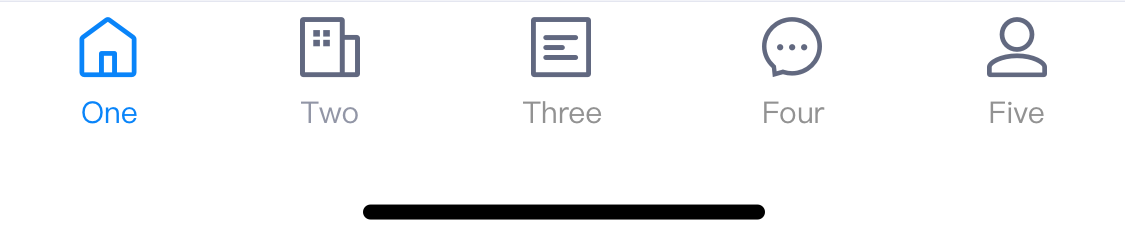 ## 二、描述
### 适用场景
1. 通用的导航栏,该类定义了一个导航栏容器,容器的结构为导航栏图标、标题
2. BottomTabBar为主容器,其中包含多个BottomTabBarItem,组成每个选项
## 三、构造函数及参数说明
```dart
BrnBottomTabBar({
Key? key,
required this.items,
this.onTap,
this.currentIndex = 0,
this.type = BrnBottomTabBarDisplayType.fixed,
this.fixedColor,
this.iconSize = 24.0,
this.isAnimation = false,
this.badgeColor,
this.isInkResponse = false,
}) : assert(items.length >= 1),
assert(
items.every((BrnBottomTabBarItem item) => item.title != null) == true,
'Every item must have a non-null title',
),
assert(0 <= currentIndex && currentIndex < items.length),
super(key: key);
```
| **参数名** | **参数类型** | **描述** | **是否必填** | **默认值** |
| --- | --- | --- | --- | --- |
| items | `List` | Tab 数据 | 是 | 无 |
| fixedColor | Color? | 选中item后的颜色 | 否 | 无 |
| currentIndex | int | 当前选中的item索引值 | 否 | 无alert |
| onTap | `ValueChanged?` | 导航项点击回调的点击回调 | 否 | 无 |
| type | BottomTabBarType | Tab样式(固定、动画) | 否 | BottomTabBarType.fixed |
| iconSize | double | tab icon 大小 | 否 | 24 |
| isAnimation | bool | 是否开启字体放大动画 | 否 | false |
| isInkResponse | bool | 是否开启聚焦动画 | 否 | false |
| badgeColor | Color? | 未读信息Badge背景颜色 | 否 | Colors.Red |
#### BrnBottomTabBarItem
```dart
const BrnBottomTabBarItem({
this.title,
required this.icon,
Widget? activeIcon,
this.selectedTextStyle,
this.unSelectedTextStyle,
this.backgroundColor,
this.badge,
this.badgeNo,
this.maxBadgeNo = 99,
}) : activeIcon = activeIcon ?? icon;
```
| **参数名** | **参数类型** | **描述** | **是否必填** | **默认值** |
| --- | --- | --- | --- | --- |
| icon | Widget | 未选中时的icon | 是 | 无 |
| activeIcon | Widget | 选中时的icon | 否 | 无 |
| title | Widget? | Tab标题名调 | 否 | 无 |
| selectedTextStyle | TextStyle? | tab 选中文本样式 | 否 | 否 |
| unSelectedTextStyle | TextStyle? | tab 未选中文本样式 | 否 | 否 |
| backgroundColor | Color? | 背景色 | 否 | 无 |
| badge | Widget? | 未读信息 | 否 | 无 |
| badgeNo | String? | 未读信息个数 | 否 | 无 |
| maxBadgeNo | int | 未读消息最大个数 | 否 | 99 |
## 四、代码演示
### 效果1
```dart
var titles = ['One', 'Two', 'Three', 'Four', 'Five','Six'];
BrnBottomTabBar(
fixedColor: Colors.blue,
currentIndex: _selectedIndex,
onTap: _onItemSelected,
badgeColor: Colors.red,
items: [
BottomTabBarItem(
icon: Image(image: AssetImage("assets/icons/navbar\_fangyuan.png")),activeIcon: Image(image: AssetImage("assets/icons/navbar\_fangyuan.png")), title: Text(titles[0])),
BottomTabBarItem(icon: Image(image: AssetImage("assets/icons/navbar\_fangyuan.png")), title: Text(titles[1])),
BottomTabBarItem(icon: Image(image: AssetImage("assets/icons/navbar\_fangyuan.png")), title: Text(titles[2])),
BottomTabBarItem(
icon: Image(image: AssetImage("assets/icons/navbar\_fangyuan.png")),
activeIcon: Image(image: AssetImage("assets/icons/navbar\_fangyuan.png")),
title: Text(titles[3])),
BottomTabBarItem(icon: Image(image: AssetImage("assets/icons/navbar\_fangyuan.png")), title: Text(titles[4])),
BottomTabBarItem(icon: Image(image: AssetImage("assets/icons/navbar\_fangyuan.png")), title: Text(titles[5])),
],
)
```
## 二、描述
### 适用场景
1. 通用的导航栏,该类定义了一个导航栏容器,容器的结构为导航栏图标、标题
2. BottomTabBar为主容器,其中包含多个BottomTabBarItem,组成每个选项
## 三、构造函数及参数说明
```dart
BrnBottomTabBar({
Key? key,
required this.items,
this.onTap,
this.currentIndex = 0,
this.type = BrnBottomTabBarDisplayType.fixed,
this.fixedColor,
this.iconSize = 24.0,
this.isAnimation = false,
this.badgeColor,
this.isInkResponse = false,
}) : assert(items.length >= 1),
assert(
items.every((BrnBottomTabBarItem item) => item.title != null) == true,
'Every item must have a non-null title',
),
assert(0 <= currentIndex && currentIndex < items.length),
super(key: key);
```
| **参数名** | **参数类型** | **描述** | **是否必填** | **默认值** |
| --- | --- | --- | --- | --- |
| items | `List` | Tab 数据 | 是 | 无 |
| fixedColor | Color? | 选中item后的颜色 | 否 | 无 |
| currentIndex | int | 当前选中的item索引值 | 否 | 无alert |
| onTap | `ValueChanged?` | 导航项点击回调的点击回调 | 否 | 无 |
| type | BottomTabBarType | Tab样式(固定、动画) | 否 | BottomTabBarType.fixed |
| iconSize | double | tab icon 大小 | 否 | 24 |
| isAnimation | bool | 是否开启字体放大动画 | 否 | false |
| isInkResponse | bool | 是否开启聚焦动画 | 否 | false |
| badgeColor | Color? | 未读信息Badge背景颜色 | 否 | Colors.Red |
#### BrnBottomTabBarItem
```dart
const BrnBottomTabBarItem({
this.title,
required this.icon,
Widget? activeIcon,
this.selectedTextStyle,
this.unSelectedTextStyle,
this.backgroundColor,
this.badge,
this.badgeNo,
this.maxBadgeNo = 99,
}) : activeIcon = activeIcon ?? icon;
```
| **参数名** | **参数类型** | **描述** | **是否必填** | **默认值** |
| --- | --- | --- | --- | --- |
| icon | Widget | 未选中时的icon | 是 | 无 |
| activeIcon | Widget | 选中时的icon | 否 | 无 |
| title | Widget? | Tab标题名调 | 否 | 无 |
| selectedTextStyle | TextStyle? | tab 选中文本样式 | 否 | 否 |
| unSelectedTextStyle | TextStyle? | tab 未选中文本样式 | 否 | 否 |
| backgroundColor | Color? | 背景色 | 否 | 无 |
| badge | Widget? | 未读信息 | 否 | 无 |
| badgeNo | String? | 未读信息个数 | 否 | 无 |
| maxBadgeNo | int | 未读消息最大个数 | 否 | 99 |
## 四、代码演示
### 效果1
```dart
var titles = ['One', 'Two', 'Three', 'Four', 'Five','Six'];
BrnBottomTabBar(
fixedColor: Colors.blue,
currentIndex: _selectedIndex,
onTap: _onItemSelected,
badgeColor: Colors.red,
items: [
BottomTabBarItem(
icon: Image(image: AssetImage("assets/icons/navbar\_fangyuan.png")),activeIcon: Image(image: AssetImage("assets/icons/navbar\_fangyuan.png")), title: Text(titles[0])),
BottomTabBarItem(icon: Image(image: AssetImage("assets/icons/navbar\_fangyuan.png")), title: Text(titles[1])),
BottomTabBarItem(icon: Image(image: AssetImage("assets/icons/navbar\_fangyuan.png")), title: Text(titles[2])),
BottomTabBarItem(
icon: Image(image: AssetImage("assets/icons/navbar\_fangyuan.png")),
activeIcon: Image(image: AssetImage("assets/icons/navbar\_fangyuan.png")),
title: Text(titles[3])),
BottomTabBarItem(icon: Image(image: AssetImage("assets/icons/navbar\_fangyuan.png")), title: Text(titles[4])),
BottomTabBarItem(icon: Image(image: AssetImage("assets/icons/navbar\_fangyuan.png")), title: Text(titles[5])),
],
)
```