---
title: BrnSingleSelectDialog
group:
title: Dialog
order: 10
---
# BrnSingleSelectDialog
适用于单选弹窗列表
## 一、效果总览
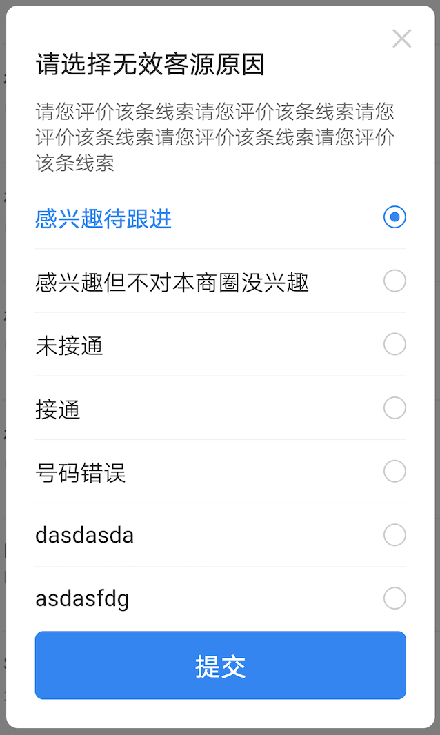 ## 二、描述
### 适用场景
适用于多选项中选择一个场景
## 三、构造函数及参数说明
### 构造函数
```dart
const BrnSingleSelectDialog(
{this.isClose: true,
this.title: "",
this.messageText,
this.messageWidget,
required this.conditions,
this.submitText,
this.submitBgColor,
this.onSubmitClick,
this.onItemClick,
this.checkedItem,
this.customWidget,
this.onCloseClick,
this.canDismissOnConfirmClick = true,
this.isCustomFollowScroll = true});
```
### 参数说明
| **参数名** | **参数类型** | **描述** | **是否必填** | **默认值** |
| ------------------------ | ----------------------------------- | ----------------------------------------------------------- | ------------ | ---------- |
| isClose | bool | 用于控制弹窗是否相应电机外部关闭,true 关闭,false 不关闭 | 否 | true |
| title | String | 弹窗标题名称 | 否 | "" |
| messageText | String? | 描述文案,优先级较 messageWidget 低,优先使用 messageWidget | 否 | |
| messageWidget | Widget? | 描述 Widget | 否 | |
| conditions | `List` | 备选项数组 | 否 | |
| checkedItem | String | 选中的选项名称 | 否 | |
| submitText | String? | 确定/提交 按钮文案 | 否 | 默认值为国际化配置文本 '提交' |
| submitBgColor | Color | 提交按钮背景颜色 | 否 | |
| customWidget | Widget | 在单选列表底部自定义 Widget | 否 | null |
| onCloseClick | VoidCallback | 点击关闭 icon 的回调 | 否 | null |
| isCustomFollowScroll | bool | 内容是否可滑动 | 否 | true |
| canDismissOnConfirmClick | bool | 是否在点击时让 Diallog 消失 | 否 | true |
| onSubmitClick | BrnSingleSelectOnSubmitCallback? | 提交按钮点击的回调 | 否 | |
| onItemClick | BrnSingleSelectOnItemClickCallback? | item 的点击回调 | 否 | |
## 三、代码演示
### 效果 1:单选弹窗
```dart
String hintText = "感兴趣待跟进";
int selectedIndex = 0;
var conditions = [
"感兴趣待跟进",
"感兴趣但不对本商圈没兴趣",
"未接通",
"接通",
"号码错误",
"dasdasda",
"asdasfdg",
"dadsadvq",
"vzxczxc"
];
showDialog(
context: context,
builder: (_) => StatefulBuilder(
builder: (context, state) {
return BrnSingleSelectDialog(
isClose: true,
title: '请选择无效客源原因',
messageText: '请您评价该条线索请您评价该条线索请您评价该条线索请您评价该条线索请您评价该条线索',
conditions: conditions,
checkedItem: conditions[selectedIndex],
submitText: '提交',
isCustomFollowScroll: true,
customWidget: TextField(
//光标颜色
maxLines: 2,
cursorColor: Color(0xFF0984F9),
//光标圆角弧度
cursorRadius: Radius.circular(2.0),
style: TextStyle(fontSize: 14, color: Color(0xFF222222)),
maxLengthEnforcement: MaxLengthEnforcement.enforced,
onChanged: (value) {},
decoration: InputDecoration(
contentPadding: EdgeInsets.all(8.0),
hintText: hintText,
hintStyle:
TextStyle(fontSize: 14, color: Color(0xFFCCCCCC)),
enabledBorder: OutlineInputBorder(
borderRadius: BorderRadius.circular(2.0),
borderSide: BorderSide(
width: 0.5,
color: Color(0xFFCCCCCC),
)),
focusedBorder: OutlineInputBorder(
borderRadius: BorderRadius.circular(2.0),
borderSide: BorderSide(
width: 0.5,
color: Color(0xFFCCCCCC),
)),
),
),
onItemClick: (BuildContext context, int index) {
hintText = conditions[index];
selectedIndex = index;
state(() {});
},
onSubmitClick: (data) {
BrnToast.show(data!, context);
});
},
));
```
## 二、描述
### 适用场景
适用于多选项中选择一个场景
## 三、构造函数及参数说明
### 构造函数
```dart
const BrnSingleSelectDialog(
{this.isClose: true,
this.title: "",
this.messageText,
this.messageWidget,
required this.conditions,
this.submitText,
this.submitBgColor,
this.onSubmitClick,
this.onItemClick,
this.checkedItem,
this.customWidget,
this.onCloseClick,
this.canDismissOnConfirmClick = true,
this.isCustomFollowScroll = true});
```
### 参数说明
| **参数名** | **参数类型** | **描述** | **是否必填** | **默认值** |
| ------------------------ | ----------------------------------- | ----------------------------------------------------------- | ------------ | ---------- |
| isClose | bool | 用于控制弹窗是否相应电机外部关闭,true 关闭,false 不关闭 | 否 | true |
| title | String | 弹窗标题名称 | 否 | "" |
| messageText | String? | 描述文案,优先级较 messageWidget 低,优先使用 messageWidget | 否 | |
| messageWidget | Widget? | 描述 Widget | 否 | |
| conditions | `List` | 备选项数组 | 否 | |
| checkedItem | String | 选中的选项名称 | 否 | |
| submitText | String? | 确定/提交 按钮文案 | 否 | 默认值为国际化配置文本 '提交' |
| submitBgColor | Color | 提交按钮背景颜色 | 否 | |
| customWidget | Widget | 在单选列表底部自定义 Widget | 否 | null |
| onCloseClick | VoidCallback | 点击关闭 icon 的回调 | 否 | null |
| isCustomFollowScroll | bool | 内容是否可滑动 | 否 | true |
| canDismissOnConfirmClick | bool | 是否在点击时让 Diallog 消失 | 否 | true |
| onSubmitClick | BrnSingleSelectOnSubmitCallback? | 提交按钮点击的回调 | 否 | |
| onItemClick | BrnSingleSelectOnItemClickCallback? | item 的点击回调 | 否 | |
## 三、代码演示
### 效果 1:单选弹窗
```dart
String hintText = "感兴趣待跟进";
int selectedIndex = 0;
var conditions = [
"感兴趣待跟进",
"感兴趣但不对本商圈没兴趣",
"未接通",
"接通",
"号码错误",
"dasdasda",
"asdasfdg",
"dadsadvq",
"vzxczxc"
];
showDialog(
context: context,
builder: (_) => StatefulBuilder(
builder: (context, state) {
return BrnSingleSelectDialog(
isClose: true,
title: '请选择无效客源原因',
messageText: '请您评价该条线索请您评价该条线索请您评价该条线索请您评价该条线索请您评价该条线索',
conditions: conditions,
checkedItem: conditions[selectedIndex],
submitText: '提交',
isCustomFollowScroll: true,
customWidget: TextField(
//光标颜色
maxLines: 2,
cursorColor: Color(0xFF0984F9),
//光标圆角弧度
cursorRadius: Radius.circular(2.0),
style: TextStyle(fontSize: 14, color: Color(0xFF222222)),
maxLengthEnforcement: MaxLengthEnforcement.enforced,
onChanged: (value) {},
decoration: InputDecoration(
contentPadding: EdgeInsets.all(8.0),
hintText: hintText,
hintStyle:
TextStyle(fontSize: 14, color: Color(0xFFCCCCCC)),
enabledBorder: OutlineInputBorder(
borderRadius: BorderRadius.circular(2.0),
borderSide: BorderSide(
width: 0.5,
color: Color(0xFFCCCCCC),
)),
focusedBorder: OutlineInputBorder(
borderRadius: BorderRadius.circular(2.0),
borderSide: BorderSide(
width: 0.5,
color: Color(0xFFCCCCCC),
)),
),
),
onItemClick: (BuildContext context, int index) {
hintText = conditions[index];
selectedIndex = index;
state(() {});
},
onSubmitClick: (data) {
BrnToast.show(data!, context);
});
},
));
```