---
title: BrnRangeInputFormItem
group:
title: Form
order: 12
---
# BrnRangeInputFormItem
## 一、效果总览
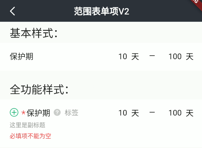 ## 二、组件描述
### 适用场景
1. 用于范围数据输入
包括"标题"、"副标题"、"错误信息提示"、"必填项提示"、"添加/删除按钮"、"消息提示"、"输入框"等元素。
### 交互规则
1. 设置是否为"必填项"("*")
2. 设置“添加/删除”图标("+"、"-"):用于接收回调函数处理新增/删除录入项操作
3. 设置“提示”图标&文案("?"):用于接收回调函数为用户展示提示信息
4. 设置此录入项是否可编辑(禁用)
5. 设置展示错误信息(error)
### 使用规范
一般用于范围数据录入页面
## 三、构造函数及参数说明
### 构造函数
```dart
BrnRangeInputFormItem(
{Key? key,
this.label,
this.title: "",
this.subTitle,
this.tipLabel,
this.prefixIconType: BrnPrefixIconType.normal,
this.error: "",
this.isEdit: true,
this.isRequire: false,
this.isPrefixIconEnabled: false,
this.onAddTap,
this.onRemoveTap,
this.onTip,
this.hintMin,
this.hintMax,
this.minUnit,
this.maxUnit,
this.leftMaxCount,
this.rightMaxCount,
this.inputType,
this.onMinChanged,
this.onMaxChanged,
this.minController,
this.maxController,
this.minInputFormatters,
this.maxInputFormatters,
this.backgroundColor,
this.themeData})
: super(key: key) {
this.themeData ??= BrnFormItemConfig();
this.themeData = BrnThemeConfigurator.instance
.getConfig(configId: this.themeData!.configId)
.formItemConfig
.merge(this.themeData);
this.themeData = this.themeData!.merge(
BrnFormItemConfig(backgroundColor: backgroundColor));
}
```
### 参数说明:
| **参数名** | **参数类型** | **描述** | **是否必填** | **默认值** | **备注** |
| --- | --- | --- | --- | --- | --- |
| backgroundColor | Color? | 表单项背景色 | 否 | 走主题配置默认色值 Colors.white | |
| label | String? | 录入项的唯一标识,主要用于录入类型页面框架中 | 否 | 无 | |
| type | Stirng | 录入项类型,主要用于录入类型页面框架中 | 否 | BrnInputItemType.textRangeInputType | 外部可根据此字段判断表单项类型 |
| title | String | 录入项标题 | 否 | '' | |
| subTitle | String? | 录入项子标题 | 否 | 无 | |
| tipLabel | String? | 录入项提示(问号图标&文案) 用户点击时触发onTip回调。 | 否 | 备注中类型3 | 1. 设置"空字符串"时展示问号图标 2. 设置"非空字符串"时展示问号图标&文案 3. 若不赋值或赋值为null时,不显示提示项 |
| prefixIconType | String | 录入项前缀图标样式 "添加项" "删除项" 详见 **BrnPrefixIconType** 类 | 否 | BrnPrefixIconType.normal | 1. 不展示图标:BrnPrefixIconType.normal 2. 展示加号图标:BrnPrefixIconType.add 3. 展示减号图标:BrnPrefixIconType.remove |
| error | String | 录入项错误提示 | 否 | '' | |
| isRequire | bool | 录入项是否为必填项(展示`*`图标),默认为 false 不必填 | 否 | false | |
| isEdit | bool | 录入项 是否可编辑 | 否 | true | true:可编辑false:禁用 |
| isPrefixIconEnabled | bool | 录入项不可编辑时(isEdit: false) "+"、"-"号是否可点击,true: 可点击回调 false: 不可点击回调 | 否 | false | |
| onAddTap | VoidCallback? | 点击"+"图标回调 | 否 | 无 | 见**prefixIconType**字段 |
| onRemoveTap | VoidCallback? | 点击"-"图标回调 | 否 | 无 | 见**prefixIconType**字段 |
| onTip | VoidCallback? | 点击"?"图标回调 | 否 | 无 | 见**tipLabel**字段 |
| minUnit | String? | 最小范围单位 | 否 | 无 | |
| maxUnit | String? | 最大范围单位 | 否 | 无 | |
| hintMin | String? | 最小范围录入项 hint 提示 | 否 | 默认值为国际化配置文本 "最小" | |
| hintMax | String? | 最大范围录入项 hint 提示 | 否 | 默认值为国际化配置文本 "最大" | |
| leftMaxCount | int? | 最小值输入框最大字符数 | 否 | 无 | |
| rightMaxCount | int? | 最大值输入框最大字符数 | 否 | 无 | |
| inputType | String? | 输入内容类型,指定键盘类型,参见 `BrnInputType` | 否 | 无 | 详见**BrnInputType**类,注意:无法通过指定键盘类型确保输入。比如不能通过指定数字键盘确保用户只输入数字。如果有要求用户只输入特定字符的需求请使用**inputFormatters**参数 |
| minInputFormatters | `List?` | 指定对最小范围输入数据的格式化要求 | 否 | 无 | |
| maxInputFormatters | `List?` | 指定对最大范围输入数据的格式化要求 | 否 | 无 | |
| onMinChanged | `ValueChanged?` | 最小范围输入文案回调 | 否 | 无 | |
| onMaxChanged | `ValueChanged?` | 最大范围输入文案回调 | 否 | 无 | |
| minController | TextEditingController? | 最小范围文本输入controller | 否 | 无 | |
| maxController | TextEditingController? | 最大范围文本输入controller | 否 | 无 | |
| themeData | BrnFormItemConfig? | 表单主题配置 | 否 | 无 | |
### 其他数据说明:
#### BrnPrefixIconType:
``` dart
class BrnPrefixIconType {
static const String normal = "type_normal";
static const String add = "type_add";
static const String remove = "type_remove";
}
```
#### BrnInputType
``` dart
class BrnInputType {
static const String text = "text";
static const String multiLine = "multiline";
static const String number = "number";
static const String decimal = "decimal";
static const String phone = "phone";
static const String date = "datetime";
static const String email = "emailAddress";
static const String url = "url";
static const String pwd = "visiblePassword";
}
```
## 四、代码演示
### 效果1:基本样式

```dart
BrnRangeInputFormItem(
minController: TextEditingController()..text = "10",
maxController: TextEditingController()..text = "100",
title: "保护期",
hintMin: "最小范围",
hintMax: "最大范围",
minUnit: "天",
maxUnit: "天",
leftMaxCount: 1,
rightMaxCount: 3,
inputType: BrnInputType.NUMBER,
onTip: () {
BrnToast.show("点击触发onTip回调", context);
},
onAddTap: () {
BrnToast.show("点击触发onAddTap回调", context);
},
onRemoveTap: () {
BrnToast.show("点击触发onRemoveTap回调", context);
},
onMinChanged: (newValue) {
BrnToast.show("点击触发回调_${newValue}_onChanged", context);
},
onMaxChanged: (newValue) {
BrnToast.show("点击触发回调_${newValue}_onChanged", context);
},
)
```
### 效果2:全功能样式
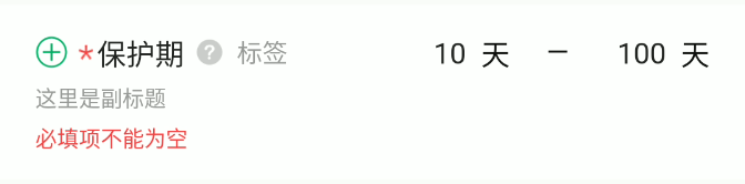
```dart
BrnRangeInputFormItem(
minController: TextEditingController()..text = "10",
maxController: TextEditingController()..text = "100",
prefixIconType: BrnPrefixIconType.add,
isRequire: true,
error: "必填项不能为空",
title: "保护期",
subTitle: "这里是副标题",
tipLabel: "标签",
isEdit: true,
hintMin: "最小范围",
hintMax: "最大范围",
minUnit: "天",
maxUnit: "天",
leftMaxCount: 1,
rightMaxCount: 3,
inputType: BrnInputType.NUMBER,
onTip: () {
BrnToast.show("点击触发onTip回调", context);
},
onAddTap: () {
BrnToast.show("点击触发onAddTap回调", context);
},
onRemoveTap: () {
BrnToast.show("点击触发onRemoveTap回调", context);
},
onMinChanged: (newValue) {
BrnToast.show("点击触发回调_${newValue}_onChanged", context);
},
onMaxChanged: (newValue) {
BrnToast.show("点击触发回调_${newValue}_onChanged", context);
},
)
```
## 二、组件描述
### 适用场景
1. 用于范围数据输入
包括"标题"、"副标题"、"错误信息提示"、"必填项提示"、"添加/删除按钮"、"消息提示"、"输入框"等元素。
### 交互规则
1. 设置是否为"必填项"("*")
2. 设置“添加/删除”图标("+"、"-"):用于接收回调函数处理新增/删除录入项操作
3. 设置“提示”图标&文案("?"):用于接收回调函数为用户展示提示信息
4. 设置此录入项是否可编辑(禁用)
5. 设置展示错误信息(error)
### 使用规范
一般用于范围数据录入页面
## 三、构造函数及参数说明
### 构造函数
```dart
BrnRangeInputFormItem(
{Key? key,
this.label,
this.title: "",
this.subTitle,
this.tipLabel,
this.prefixIconType: BrnPrefixIconType.normal,
this.error: "",
this.isEdit: true,
this.isRequire: false,
this.isPrefixIconEnabled: false,
this.onAddTap,
this.onRemoveTap,
this.onTip,
this.hintMin,
this.hintMax,
this.minUnit,
this.maxUnit,
this.leftMaxCount,
this.rightMaxCount,
this.inputType,
this.onMinChanged,
this.onMaxChanged,
this.minController,
this.maxController,
this.minInputFormatters,
this.maxInputFormatters,
this.backgroundColor,
this.themeData})
: super(key: key) {
this.themeData ??= BrnFormItemConfig();
this.themeData = BrnThemeConfigurator.instance
.getConfig(configId: this.themeData!.configId)
.formItemConfig
.merge(this.themeData);
this.themeData = this.themeData!.merge(
BrnFormItemConfig(backgroundColor: backgroundColor));
}
```
### 参数说明:
| **参数名** | **参数类型** | **描述** | **是否必填** | **默认值** | **备注** |
| --- | --- | --- | --- | --- | --- |
| backgroundColor | Color? | 表单项背景色 | 否 | 走主题配置默认色值 Colors.white | |
| label | String? | 录入项的唯一标识,主要用于录入类型页面框架中 | 否 | 无 | |
| type | Stirng | 录入项类型,主要用于录入类型页面框架中 | 否 | BrnInputItemType.textRangeInputType | 外部可根据此字段判断表单项类型 |
| title | String | 录入项标题 | 否 | '' | |
| subTitle | String? | 录入项子标题 | 否 | 无 | |
| tipLabel | String? | 录入项提示(问号图标&文案) 用户点击时触发onTip回调。 | 否 | 备注中类型3 | 1. 设置"空字符串"时展示问号图标 2. 设置"非空字符串"时展示问号图标&文案 3. 若不赋值或赋值为null时,不显示提示项 |
| prefixIconType | String | 录入项前缀图标样式 "添加项" "删除项" 详见 **BrnPrefixIconType** 类 | 否 | BrnPrefixIconType.normal | 1. 不展示图标:BrnPrefixIconType.normal 2. 展示加号图标:BrnPrefixIconType.add 3. 展示减号图标:BrnPrefixIconType.remove |
| error | String | 录入项错误提示 | 否 | '' | |
| isRequire | bool | 录入项是否为必填项(展示`*`图标),默认为 false 不必填 | 否 | false | |
| isEdit | bool | 录入项 是否可编辑 | 否 | true | true:可编辑false:禁用 |
| isPrefixIconEnabled | bool | 录入项不可编辑时(isEdit: false) "+"、"-"号是否可点击,true: 可点击回调 false: 不可点击回调 | 否 | false | |
| onAddTap | VoidCallback? | 点击"+"图标回调 | 否 | 无 | 见**prefixIconType**字段 |
| onRemoveTap | VoidCallback? | 点击"-"图标回调 | 否 | 无 | 见**prefixIconType**字段 |
| onTip | VoidCallback? | 点击"?"图标回调 | 否 | 无 | 见**tipLabel**字段 |
| minUnit | String? | 最小范围单位 | 否 | 无 | |
| maxUnit | String? | 最大范围单位 | 否 | 无 | |
| hintMin | String? | 最小范围录入项 hint 提示 | 否 | 默认值为国际化配置文本 "最小" | |
| hintMax | String? | 最大范围录入项 hint 提示 | 否 | 默认值为国际化配置文本 "最大" | |
| leftMaxCount | int? | 最小值输入框最大字符数 | 否 | 无 | |
| rightMaxCount | int? | 最大值输入框最大字符数 | 否 | 无 | |
| inputType | String? | 输入内容类型,指定键盘类型,参见 `BrnInputType` | 否 | 无 | 详见**BrnInputType**类,注意:无法通过指定键盘类型确保输入。比如不能通过指定数字键盘确保用户只输入数字。如果有要求用户只输入特定字符的需求请使用**inputFormatters**参数 |
| minInputFormatters | `List?` | 指定对最小范围输入数据的格式化要求 | 否 | 无 | |
| maxInputFormatters | `List?` | 指定对最大范围输入数据的格式化要求 | 否 | 无 | |
| onMinChanged | `ValueChanged?` | 最小范围输入文案回调 | 否 | 无 | |
| onMaxChanged | `ValueChanged?` | 最大范围输入文案回调 | 否 | 无 | |
| minController | TextEditingController? | 最小范围文本输入controller | 否 | 无 | |
| maxController | TextEditingController? | 最大范围文本输入controller | 否 | 无 | |
| themeData | BrnFormItemConfig? | 表单主题配置 | 否 | 无 | |
### 其他数据说明:
#### BrnPrefixIconType:
``` dart
class BrnPrefixIconType {
static const String normal = "type_normal";
static const String add = "type_add";
static const String remove = "type_remove";
}
```
#### BrnInputType
``` dart
class BrnInputType {
static const String text = "text";
static const String multiLine = "multiline";
static const String number = "number";
static const String decimal = "decimal";
static const String phone = "phone";
static const String date = "datetime";
static const String email = "emailAddress";
static const String url = "url";
static const String pwd = "visiblePassword";
}
```
## 四、代码演示
### 效果1:基本样式

```dart
BrnRangeInputFormItem(
minController: TextEditingController()..text = "10",
maxController: TextEditingController()..text = "100",
title: "保护期",
hintMin: "最小范围",
hintMax: "最大范围",
minUnit: "天",
maxUnit: "天",
leftMaxCount: 1,
rightMaxCount: 3,
inputType: BrnInputType.NUMBER,
onTip: () {
BrnToast.show("点击触发onTip回调", context);
},
onAddTap: () {
BrnToast.show("点击触发onAddTap回调", context);
},
onRemoveTap: () {
BrnToast.show("点击触发onRemoveTap回调", context);
},
onMinChanged: (newValue) {
BrnToast.show("点击触发回调_${newValue}_onChanged", context);
},
onMaxChanged: (newValue) {
BrnToast.show("点击触发回调_${newValue}_onChanged", context);
},
)
```
### 效果2:全功能样式

```dart
BrnRangeInputFormItem(
minController: TextEditingController()..text = "10",
maxController: TextEditingController()..text = "100",
prefixIconType: BrnPrefixIconType.add,
isRequire: true,
error: "必填项不能为空",
title: "保护期",
subTitle: "这里是副标题",
tipLabel: "标签",
isEdit: true,
hintMin: "最小范围",
hintMax: "最大范围",
minUnit: "天",
maxUnit: "天",
leftMaxCount: 1,
rightMaxCount: 3,
inputType: BrnInputType.NUMBER,
onTip: () {
BrnToast.show("点击触发onTip回调", context);
},
onAddTap: () {
BrnToast.show("点击触发onAddTap回调", context);
},
onRemoveTap: () {
BrnToast.show("点击触发onRemoveTap回调", context);
},
onMinChanged: (newValue) {
BrnToast.show("点击触发回调_${newValue}_onChanged", context);
},
onMaxChanged: (newValue) {
BrnToast.show("点击触发回调_${newValue}_onChanged", context);
},
)
```