---
title: BrnShadowCard
group:
title: Card
order: 7
---
# BrnShadowCard
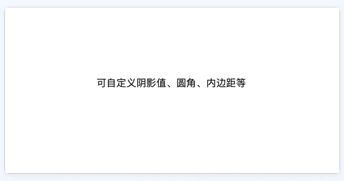
支持自定义边框属性阴影卡片
## 一、效果
 ## 二、描述
### 适用场景
业务方自定义背景的颜色,边框属性,child 子类等属性。
## 三、构造函数及参数说明
### 构造函数
```dart
BrnShadowCard(
{required this.child,
this.color = const Color(0xfffafafa),
this.shadowColor = const Color(0xffeeeeee),
this.padding = const EdgeInsets.all(0),
this.circular = 4.0,
this.blurRadius = 5.0,
this.spreadRadius = 0,
this.offset = Offset.zero,
this.borderWidth = 0.5});
```
### 参数说明
| **参数名** | **参数类型** | **描述** | **是否必填** | **默认值** |
| ------------ | ------------------ | ----------------- | ------------ | ----------------- |
| color | Color | 背景色 | 否 | Color(0xfffafafa) |
| shadowColor | Color | 阴影颜色 | 否 | Color(0xffeeeeee) |
| offset | Offset | 阴影 xy 轴偏移量 | 否 | 0 |
| padding | EdgeInsetsGeometry | 内边距 | 否 | EdgeInsets.all(0) |
| circular | double | 圆角大小 | 否 | 4.0 |
| blurRadius | double | 阴影模糊程度 | 否 | 5.0 |
| spreadRadius | double | 阴影扩散程度 | 否 | 0 |
| borderWidth | double | 边框宽度 | 否 | 0.5 |
| child | Widget | 需要填充的 widget | 是 | 无 |
## 三、代码演示
### 效果 1
## 二、描述
### 适用场景
业务方自定义背景的颜色,边框属性,child 子类等属性。
## 三、构造函数及参数说明
### 构造函数
```dart
BrnShadowCard(
{required this.child,
this.color = const Color(0xfffafafa),
this.shadowColor = const Color(0xffeeeeee),
this.padding = const EdgeInsets.all(0),
this.circular = 4.0,
this.blurRadius = 5.0,
this.spreadRadius = 0,
this.offset = Offset.zero,
this.borderWidth = 0.5});
```
### 参数说明
| **参数名** | **参数类型** | **描述** | **是否必填** | **默认值** |
| ------------ | ------------------ | ----------------- | ------------ | ----------------- |
| color | Color | 背景色 | 否 | Color(0xfffafafa) |
| shadowColor | Color | 阴影颜色 | 否 | Color(0xffeeeeee) |
| offset | Offset | 阴影 xy 轴偏移量 | 否 | 0 |
| padding | EdgeInsetsGeometry | 内边距 | 否 | EdgeInsets.all(0) |
| circular | double | 圆角大小 | 否 | 4.0 |
| blurRadius | double | 阴影模糊程度 | 否 | 5.0 |
| spreadRadius | double | 阴影扩散程度 | 否 | 0 |
| borderWidth | double | 边框宽度 | 否 | 0.5 |
| child | Widget | 需要填充的 widget | 是 | 无 |
## 三、代码演示
### 效果 1
 ```dart
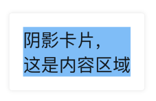
BrnShadowCard(
padding: EdgeInsets.all(20),
color: Colors.white,
child: Container(
color: Colors.blue[200],
child: Text(
'阴影卡片,\n这是内容区域',
style: TextStyle(fontSize: 26),
),
),
);
```
```dart
BrnShadowCard(
padding: EdgeInsets.all(20),
color: Colors.white,
child: Container(
color: Colors.blue[200],
child: Text(
'阴影卡片,\n这是内容区域',
style: TextStyle(fontSize: 26),
),
),
);
```