---
title: BrnPopupWindow
group:
title: Popup
order: 24
---
# BrnPopupWindow
悬浮框
## 一、效果总览
 ## 二、描述
### 适用场景
1. 显示在目标控件的上方或下方的Tips提示。
2. 使用静态方法showPopWindow 弹出提示
## 三、构造函数及参数配置
### 构造函数
``` dart
BrnPopupWindow(this.context,
{Key? key,
this.text,
required this.popKey,
this.arrowHeight = 6.0,
this.textStyle,
this.backgroundColor,
this.isShowCloseIcon = false,
this.offset = 0,
this.popDirection = BrnPopupDirection.bottom,
this.widget,
this.paddingInsets =
const EdgeInsets.only(left: 18, top: 14, right: 18, bottom: 14),
this.borderRadius = 4,
this.borderColor,
this.canWrap = false,
this.spaceMargin = 20,
this.arrowOffset,
this.onDismiss,
this.turnOverFromBottom = 50.0})
: super(key: key);
```
### 参数配置
| **参数名** | **参数类型** | **描述** | **是否必填** | **默认值** |
| --- | --- | --- | --- | --- |
| context | BuildContext | 路由跳转Push和退出Pop的时候需要使用 | 是 | 无 |
| text | String? | Tips的文本内容 | 是 | 无 |
| popKey | GlobalKey | 目标组件和当前组件传入的同一个GlobalKey值,便于计算目标组件位置等 | 是 | 无 |
| arrowHeight | double | 箭头的高度 | 否 | 6.0 |
| arrowOffset | double? | 箭头偏移量 | 否 | arrowOffset = popKey 对应的 Widget 左右居中 - spaceMargin |
| textStyle | TextStyle? | 显示的文本的样式 | 否 | TextStyle(fontSize: 16, color: Color(0xFFFFFFFF)) |
| backgroundColor | Color? | Tips的背景颜色 | 否 | Color(0xFF1A1A1A) |
| isShowCloseIcon | bool | 是否显示关闭图标 | 否 | false |
| offset | double | Tips距离目标组件的偏移量 | 否 | 0 |
| popDirection | PopDirection | 位于targetView的方向 | 否 | PopDirection.bottom |
| widget | Widget? | 自定义显示的Widget | 否 | 无 |
| paddingInsets | EdgeInsets | Tips的内部Padding | 否 | EdgeInsets.only(left: 18, top: 14, right: 18, bottom: 14) |
| borderRadius | double | Tips的外部圆角 | 否 | 4 |
| borderColor | Color? | 边框颜色 | 否 | Colors.transparent |
| canWrap | bool | 是否能多行显示 默认false:单行显示 | 否 | false |
| spaceMargin | double | Tips距离目标组件左右边线的距离 | 否 | 20 |
| onDismiss | VoidCallback? | Tips消失时候的接口回调 | 否 | 无 |
| turnOverFromBottom | double | popWindow距离底部的距离小于此值的时候,自动将popWindow在targetView上面弹出 | 否 | 50 |
## 四、代码展示
### 效果1:Tips/左
## 二、描述
### 适用场景
1. 显示在目标控件的上方或下方的Tips提示。
2. 使用静态方法showPopWindow 弹出提示
## 三、构造函数及参数配置
### 构造函数
``` dart
BrnPopupWindow(this.context,
{Key? key,
this.text,
required this.popKey,
this.arrowHeight = 6.0,
this.textStyle,
this.backgroundColor,
this.isShowCloseIcon = false,
this.offset = 0,
this.popDirection = BrnPopupDirection.bottom,
this.widget,
this.paddingInsets =
const EdgeInsets.only(left: 18, top: 14, right: 18, bottom: 14),
this.borderRadius = 4,
this.borderColor,
this.canWrap = false,
this.spaceMargin = 20,
this.arrowOffset,
this.onDismiss,
this.turnOverFromBottom = 50.0})
: super(key: key);
```
### 参数配置
| **参数名** | **参数类型** | **描述** | **是否必填** | **默认值** |
| --- | --- | --- | --- | --- |
| context | BuildContext | 路由跳转Push和退出Pop的时候需要使用 | 是 | 无 |
| text | String? | Tips的文本内容 | 是 | 无 |
| popKey | GlobalKey | 目标组件和当前组件传入的同一个GlobalKey值,便于计算目标组件位置等 | 是 | 无 |
| arrowHeight | double | 箭头的高度 | 否 | 6.0 |
| arrowOffset | double? | 箭头偏移量 | 否 | arrowOffset = popKey 对应的 Widget 左右居中 - spaceMargin |
| textStyle | TextStyle? | 显示的文本的样式 | 否 | TextStyle(fontSize: 16, color: Color(0xFFFFFFFF)) |
| backgroundColor | Color? | Tips的背景颜色 | 否 | Color(0xFF1A1A1A) |
| isShowCloseIcon | bool | 是否显示关闭图标 | 否 | false |
| offset | double | Tips距离目标组件的偏移量 | 否 | 0 |
| popDirection | PopDirection | 位于targetView的方向 | 否 | PopDirection.bottom |
| widget | Widget? | 自定义显示的Widget | 否 | 无 |
| paddingInsets | EdgeInsets | Tips的内部Padding | 否 | EdgeInsets.only(left: 18, top: 14, right: 18, bottom: 14) |
| borderRadius | double | Tips的外部圆角 | 否 | 4 |
| borderColor | Color? | 边框颜色 | 否 | Colors.transparent |
| canWrap | bool | 是否能多行显示 默认false:单行显示 | 否 | false |
| spaceMargin | double | Tips距离目标组件左右边线的距离 | 否 | 20 |
| onDismiss | VoidCallback? | Tips消失时候的接口回调 | 否 | 无 |
| turnOverFromBottom | double | popWindow距离底部的距离小于此值的时候,自动将popWindow在targetView上面弹出 | 否 | 50 |
## 四、代码展示
### 效果1:Tips/左
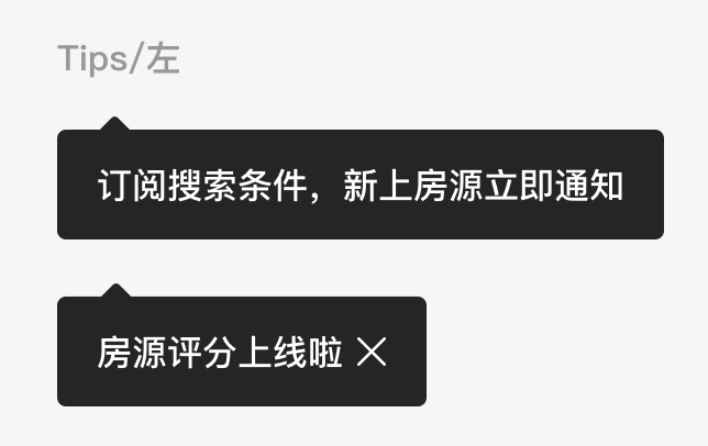 ```dart
RaisedButton(
key: _leftKey,
onPressed: () {
// popKey值和目标组件的GlobalKey要保持一致*
BrnPopupWindow.showPopWindow(
context, "订阅搜索条件,新上房源立即通知", _leftKey,
hasCloseIcon: true);
},
child: Text("左侧带关闭Tips"),
)
```
### 效果2:Tips/右
```dart
RaisedButton(
key: _leftKey,
onPressed: () {
// popKey值和目标组件的GlobalKey要保持一致*
BrnPopupWindow.showPopWindow(
context, "订阅搜索条件,新上房源立即通知", _leftKey,
hasCloseIcon: true);
},
child: Text("左侧带关闭Tips"),
)
```
### 效果2:Tips/右
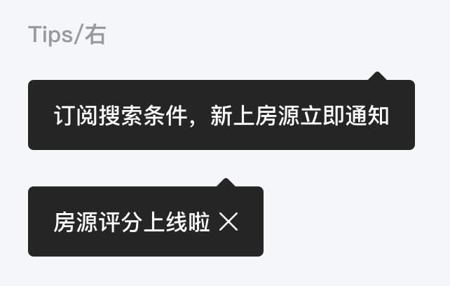 ```dart
RaisedButton(
key: _leftKey4,
onPressed: () {
BrnPopupWindow.showPopWindow(
context, "订阅搜索条件,新上房源立即通知", _leftKey4,
hasCloseIcon: true,
dismissCallback: () {},
popDirection: PopDirection.bottom);
},
child: Text("右侧带关闭Tips"),
)
```
### 效果3:其他封装用法:Popup 中展示简单列表
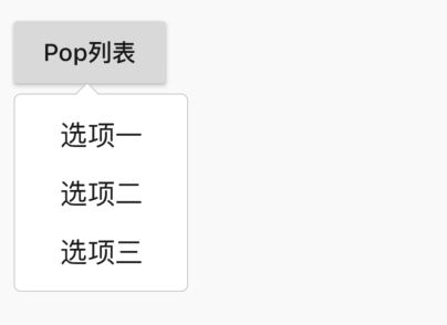
注意:onItemClick 必须返回 true 或 false 决定是否拦截点击事件, 如果为 true 拦截事件,则内部不再走 pop 消失逻辑。
```dart
BrnPopupListWindow.showPopListWindow(context, _leftKeylist0,
data: ['选项一', '选项二', '选项三'], onItemClick: (index, item) {
BrnToast.show(item, context);
return false;
}, hasCloseIcon: true);
```
```dart
RaisedButton(
key: _leftKey4,
onPressed: () {
BrnPopupWindow.showPopWindow(
context, "订阅搜索条件,新上房源立即通知", _leftKey4,
hasCloseIcon: true,
dismissCallback: () {},
popDirection: PopDirection.bottom);
},
child: Text("右侧带关闭Tips"),
)
```
### 效果3:其他封装用法:Popup 中展示简单列表

注意:onItemClick 必须返回 true 或 false 决定是否拦截点击事件, 如果为 true 拦截事件,则内部不再走 pop 消失逻辑。
```dart
BrnPopupListWindow.showPopListWindow(context, _leftKeylist0,
data: ['选项一', '选项二', '选项三'], onItemClick: (index, item) {
BrnToast.show(item, context);
return false;
}, hasCloseIcon: true);
```